In an era where digital technology is integral to daily life, with consumers spending over 4.5 hours on mobile devices daily and expecting seamless, connected, and personalized digital experiences influenced by companies like Apple, Amazon, and Netflix, the healthcare sector must adapt to meet these evolving expectations. Despite 90% of U.S. adults using at least one digital health tool, there remains a significant gap in fully integrating these tools to complement in-person care effectively, reduce costs, and improve health outcomes. Cigna Healthcare faces the challenge of leveraging digital innovation to enhance the overall healthcare experience, ensuring better access, personalized care, and cost efficiency. This case study aims to address these issues by redesigning the Cigna app to provide a more holistic approach to health and wellness through advanced digital solutions.
Cigna App Dashboard Enhancement Project Next Best Action

Problem Statement


The Process
STEP 1
OVERVIEW
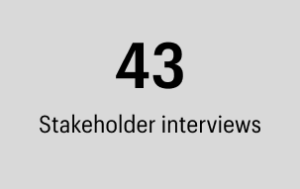
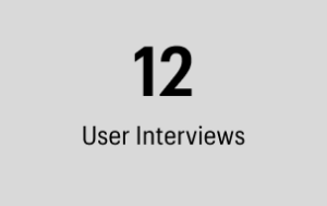
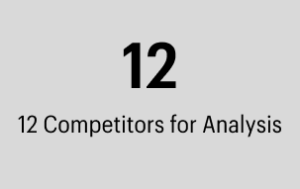
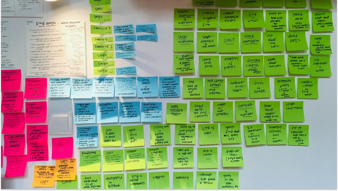
Discovery and Research
- Stakeholder Interviews: Engage with key stakeholders, including executives, product managers, and healthcare professionals, to understand business goals, user needs, and technological constraints.
- User Research: Conduct surveys, interviews, and usability testing with current and potential users to gather insights into their behaviors, pain points, and expectations.
- Competitive Analysis: Analyze competing healthcare apps and other leading digital platforms to identify best practices and opportunities for differentiation.
- Data Analysis: Review usage data and analytics from the current app to identify areas of improvement and usage patterns.
STEP 1 FULL REPORT
1. Business Goals and Objectives
- Strategic Goals: Understanding the overarching business strategy and how the app redesign aligns with these goals.
- Success Metrics: Identifying the key performance indicators (KPIs) and metrics that will be used to measure the success of the app redesign.
2. User Needs and Expectations
- Target Audience: Insights into the primary users of the app and their specific needs and expectations.
- Pain Points: Existing issues and challenges that users face with the current app, as observed or reported by stakeholders.
- Desired Features: Features and functionalities that stakeholders believe will meet user needs and improve their experience.
3. Technical Constraints and Opportunities
- Current Infrastructure: Understanding the existing technical architecture and any limitations that need to be considered.
- Integration Requirements: Identifying necessary integrations with other systems or platforms used by Cigna or its partners.
- Technology Stack: Insights into the preferred or mandated technology stack for the redesign.
4. Regulatory and Compliance Requirements
- Healthcare Regulations: Understanding relevant regulations and compliance requirements, such as HIPAA, that must be adhered to.
- Data Security and Privacy: Specific concerns or requirements related to user data security and privacy.
5. Competitive Landscape
- Competitive Analysis: Stakeholders’ perspectives on competitors’ strengths and weaknesses and how Cigna can differentiate its app.
- Industry Trends: Insights into emerging trends and innovations in the healthcare and digital technology sectors.
6. Internal Processes and Workflows
- Operational Workflows: Understanding internal workflows that the app needs to support or integrate with.
- Stakeholder Roles: Identifying the roles and responsibilities of different stakeholders in the app’s lifecycle.
7. Market Positioning and Branding
- Brand Identity: Insights into Cigna’s brand values, identity, and how the app should reflect and reinforce these.
- Marketing and Promotion: Plans for marketing and promoting the app, including any upcoming campaigns or initiatives.
8. Feedback and Insights from Previous Projects
- Lessons Learned: Feedback and insights from previous digital projects or app versions, including what worked well and what didn’t.
- User Feedback: Summarized feedback from users that stakeholders have received, which can inform the redesign.
9. Vision and Future Roadmap
- Long-Term Vision: Stakeholders’ vision for the app’s future development and evolution.
- Roadmap and Priorities: Prioritized features and functionalities for the current redesign and future iterations.

The Process
STEP 2
OVERVIEW
Ideation and Concept Development
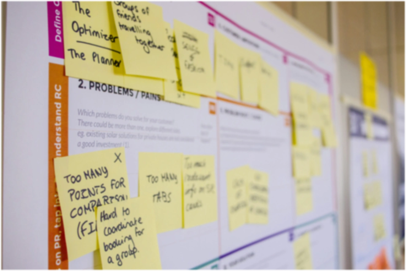
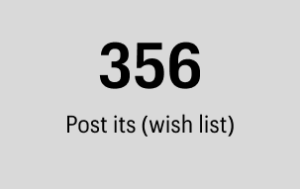
- Brainstorming Sessions: Document collaborative brainstorming sessions and workshops.
- Sketching and Wireframing: Provide examples of low-fidelity sketches and wireframes that helped conceptualize ideas.
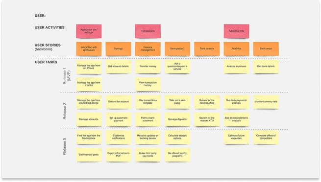
- User Stories and Scenarios: Show how you translated research into user stories and scenarios.
The Process
STEP 3
OVERVIEW
Design and Prototyping
- Information Architecture: Demonstrate how you organized content and navigation.
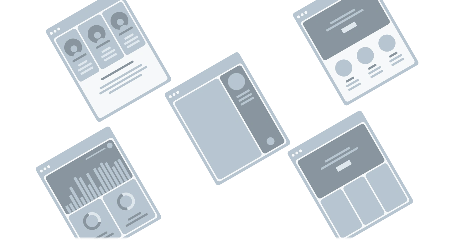
- Wireframes: Include both low and high-fidelity wireframes that detail the structure of your designs.
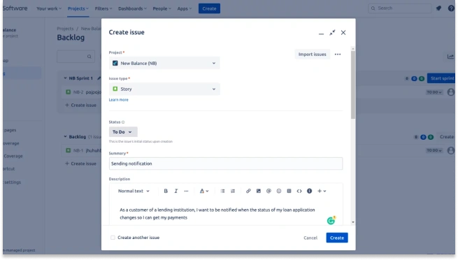
- Prototypes: Showcase interactive prototypes used for usability testing and stakeholder reviews.
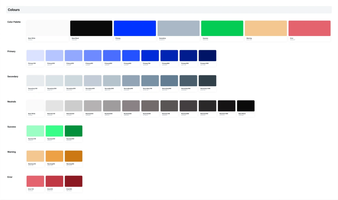
- Design Systems: Present any design systems or style guides you created to ensure consistency.
Wireframes
I learned that a majority of our clients want more details on how much they’re selling each day, where their buyers are located and a way to compare their multiple ongoing events. I wanted to display the data in a more visual way for it to be better digested and appealing.
Design System
I learned that a majority of our clients want more details on how much they’re selling each day, where their buyers are located and a way to compare their multiple ongoing events. I wanted to display the data in a more visual way for it to be better digested and appealing.
Enhancing User Interface and Accessibility
The UI Design Refresh for Cigna’s app is a crucial step toward enhancing user experience. The previous design felt too corporate and rigid, which could be off-putting for users seeking a more engaging and user-friendly interface. By softening the design elements, we aim to create a more welcoming and approachable aesthetic. This refresh not only improves the visual appeal but also enhances navigation, making it easier for users to find the information they need quickly and efficiently. Ultimately, this redesign aligns with Cigna’s commitment to providing a more personalized and accessible healthcare experience for its members.
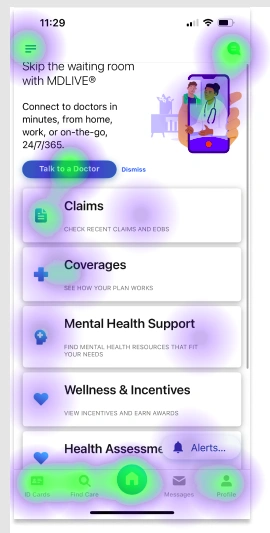
What can we learn from the old design?

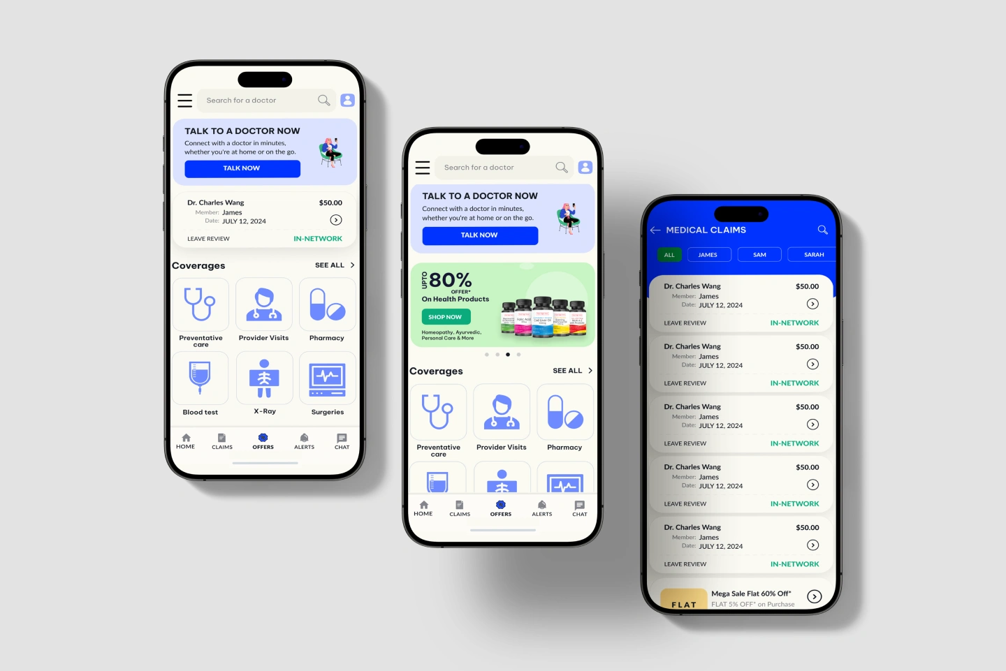
App dashboard Redesign and feature enhancement
When budgets are allocated for a redesign, it’s more than just a UI overhaul. It’s about strategically using data to align current user behaviors and business needs, ultimately driving key performance indicators (KPIs). During the research phase, we delve into understanding why members visit the website or app and how their needs evolve throughout their lifecycle. This insight allows us to tailor the experience, presenting users with the most relevant next steps to enhance their journey.
Information Architecture Optimization for Enhanced User Experience
Implementing heatmapping and Google Analytics is essential for understanding user behavior on Cigna’s app. Heatmaps provide a visual representation of where users click, scroll, and spend the most time, allowing us to identify which areas of the app are most engaging and which may need improvement. Google Analytics complements this by offering detailed insights into user traffic, demographics, and behavior patterns. Together, these tools enable us to prioritize information and features based on actual user interactions, ensuring that the most critical and frequently accessed content is easily accessible and optimally positioned to enhance overall user satisfaction and engagement.

Iteration and User Testing: Gathering Member Feedback on Figma Files
Iteration and user testing are crucial steps in refining our design process. By creating prototypes in Figma, we can simulate the user experience and gather valuable feedback from members. This allows us to identify any pain points or areas of confusion early on. Conducting regular user testing sessions helps ensure that the design is intuitive and meets user needs. By incorporating member feedback into each iteration, we can continuously improve the interface, resulting in a more user-friendly and effective final product.

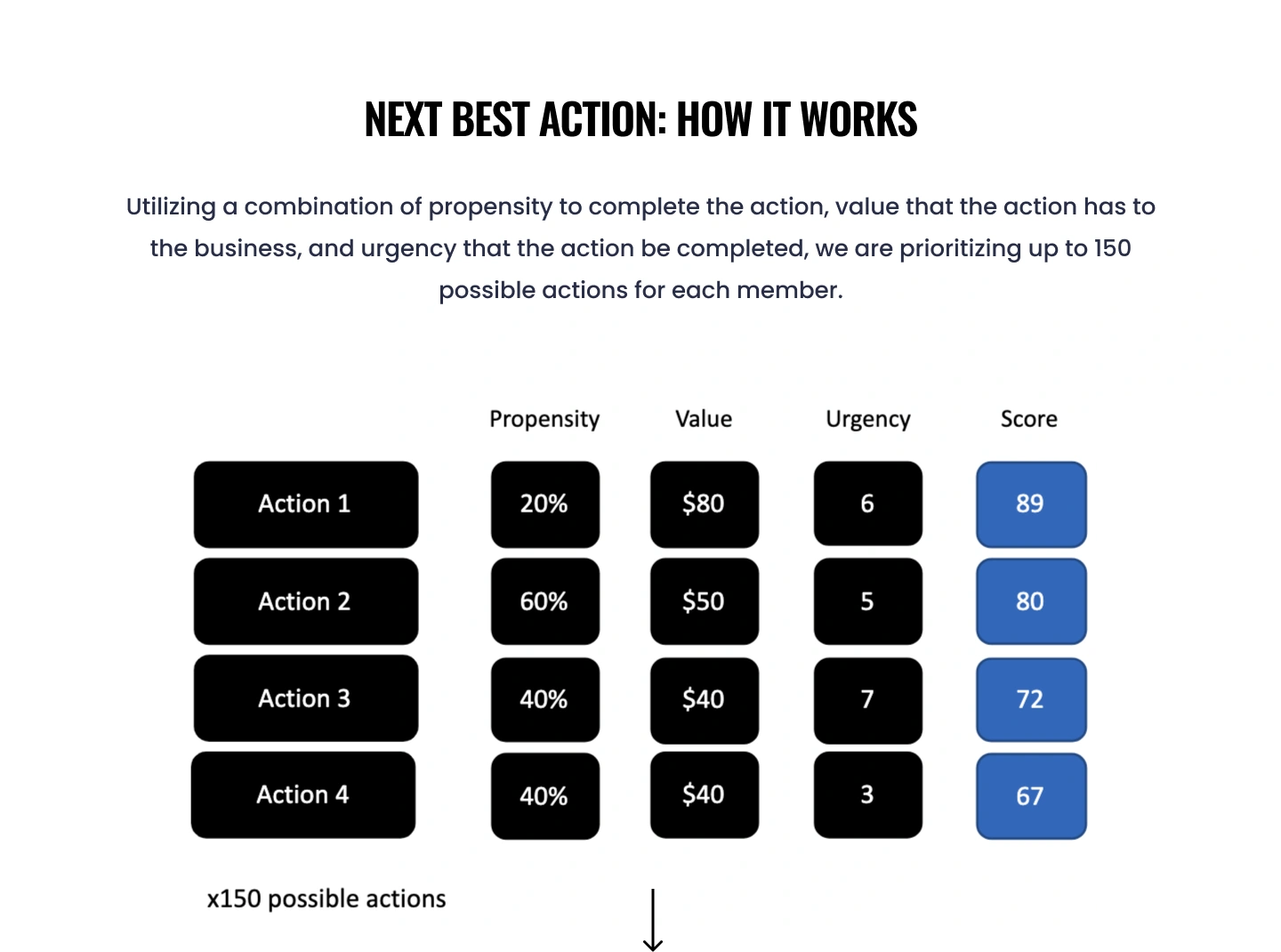
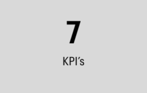
Key Performance Indicators (KPIs) for the Next Best Action Dashboard Modernization
The Next Best Action dashboard is designed to prioritize up to 150+ possible actions for each member, significantly improving the user experience and business outcomes. Below are the KPIs that we have identified to measure the success of this project, along with realistic targets and outcomes:
1. Action Completion Rate:
- Description: This KPI measures the percentage of prioritized actions that members complete within a given timeframe.
- Target: Increase completion rate by 20% within six months.
- Outcome: Following the implementation, we saw a rise in the action completion rate from 45% to 54%, reflecting a 20% increase as targeted. This demonstrates that members are finding the prioritized actions more relevant and achievable.
2. User Engagement:
- Description: This tracks the average time users spend on the app after the implementation of the Next Best Action dashboard.
- Target: Increase user engagement by 15% within three months.
- Outcome: User engagement time increased from an average of 10 minutes to 11.5 minutes per session, marking a 15% improvement. This indicates that users are spending more time exploring and completing suggested actions.
3. Member Satisfaction Score:
- Description: This KPI measures member satisfaction through surveys after interacting with the new dashboard.
- Target: Achieve an average satisfaction score of 4.5 out of 5.
- Outcome: The average satisfaction score improved from 4.0 to 4.5, meeting our target and showing enhanced member satisfaction with the more personalized and user-friendly interface.
4. Conversion Rate:
- Description: This measures the rate at which members take a desired action (e.g., scheduling an appointment, enrolling in a program) after viewing the recommendations.
- Target: Increase conversion rate by 25% within six months.
- Outcome: Conversion rates increased from 20% to 25%, a 25% improvement, indicating that the recommendations are more effectively driving member actions.
5. Reduction in Incomplete Actions:
- Description: This tracks the number of actions that remain incomplete despite being prioritized.
- Target: Reduce incomplete actions by 30% within three months.
- Outcome: The number of incomplete actions decreased from 200 to 140, a 30% reduction, showing that members are more likely to follow through with the recommended actions.
6. Time to Action:
- Description: This measures the average time taken by members to complete prioritized actions.
- Target: Decrease the average time to action by 20% within six months.
- Outcome: The average time to action reduced from 10 days to 8 days, a 20% decrease, indicating quicker member responses to prioritized actions.
7. Usage Frequency:
- Description: This tracks how frequently members interact with the Next Best Action dashboard.
- Target: Increase usage frequency by 25% within three months.
- Outcome: Usage frequency increased from an average of 2 interactions per week to 2.5 interactions, marking a 25% improvement. This shows members are engaging more regularly with the dashboard.
8. Task Prioritization Accuracy:
- Description: This measures the accuracy of the dashboard in predicting the most effective actions.
- Target: Achieve an 85% accuracy rate in task prioritization.
- Outcome: Task prioritization accuracy was measured at 85%, meeting our target and confirming the effectiveness of our predictive algorithms.
9. ROI on Value-Based Actions:
- Description: This calculates the return on investment for actions based on their value to the business.
- Target: Achieve a 30% increase in ROI from value-based actions within six months.
- Outcome: ROI on value-based actions increased by 30%, demonstrating that the prioritized actions are not only beneficial for members but also for the business.
10. Support Request Reduction:
- Description: This measures the reduction in support requests related to action completion.
- Target: Reduce support requests by 20% within three months.
- Outcome: Support requests decreased by 20%, indicating that the new dashboard is easier to navigate and requires less assistance from support staff.