Hotel Search Results
Problem Statement
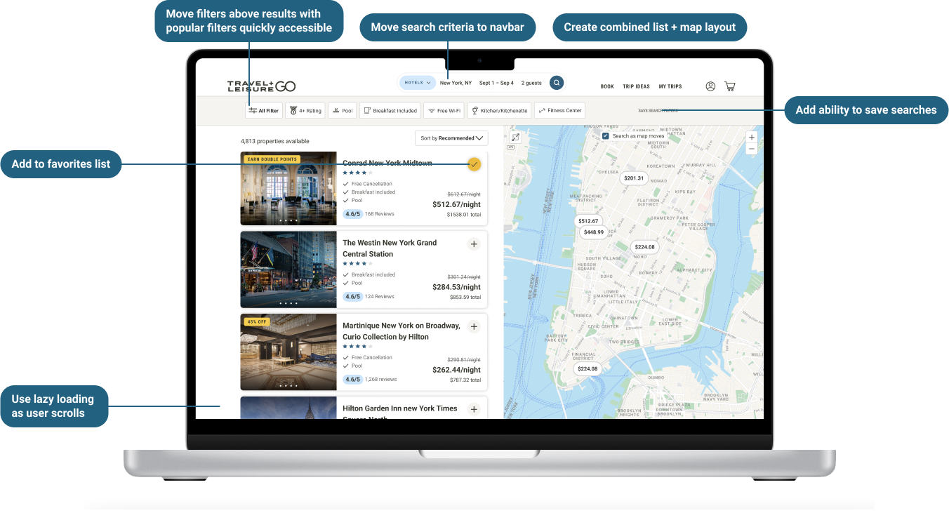
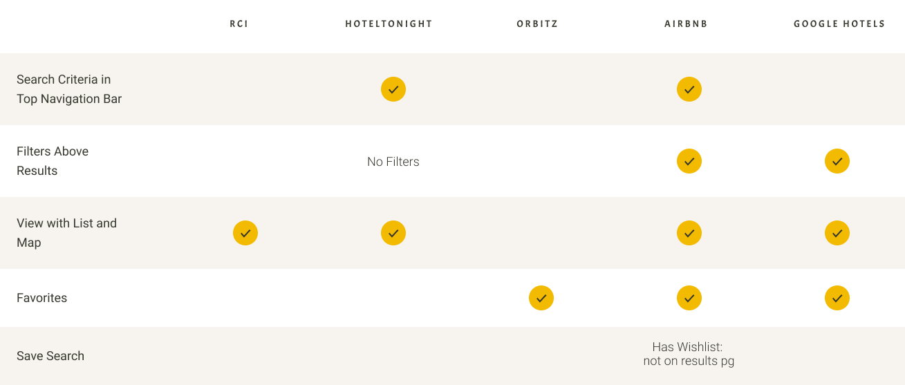
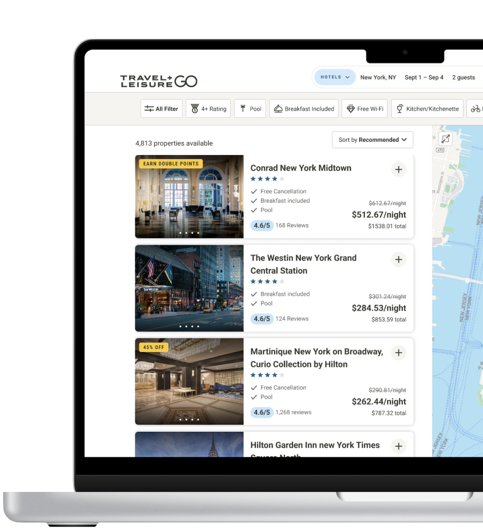
Current search results are not in-line with industry standards. Qualitative user research and competitor analysis shows that users want to narrow down results quickly, and use the map and cards at the same time.
User Needs
I want to be able to narrow down results easily. I don’t usually purchase travel in one
sitting so I’d like easily pick up where I left off. To do that, be able to:

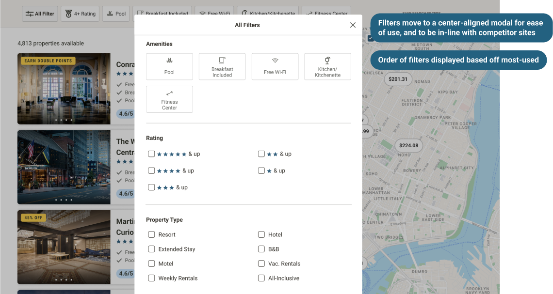
Sort and filter quickly and easily, including quick filter options so user does not have to open any modal or dropdown

Have the ability to see the results and map at the same time, so I can use the map to narrow down my results

Have the ability to save properties and searches so I can come back to my research
best practices
1 . Promote Important Filters Above the List to Shorten Search Time
Source: Baymard Institute #474
2. Always Display Search Results in “Split View” with List and Map
Source: Baymard Institute #1873
Qualitative Research
We performed un-moderated live user tests, one to get feedback on competitor layouts, and one to validate our prototypes.
Users prefer a combined list and map view while they are narrowing down their results.
Users want relevant sort and filters that can be accessed quickly.
Prototype Discovery
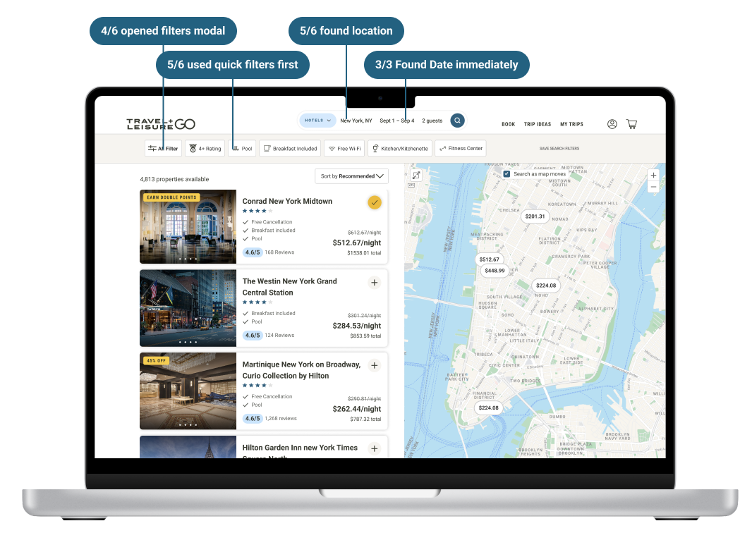
Is it easy for users to edit search criteria (location, dates, guests) in the top navbar?
Can users filter and sort easily?
Do users use the quick filters?
What to test
# of clicks of Filters – which ones are most important to users?
Are users saving searches?
Are users saving properties to their list?
Are users sharing their lists?
Scroll depth – how many results are they scrolling past?
Map interactions – Are they clicking checkbox or expanding the map?
