PROJECTS
Visual History Archive.
Website Redesign
ABOUT PROJECT
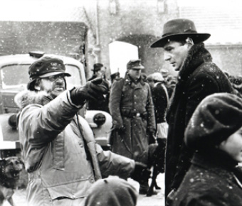
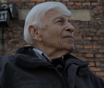
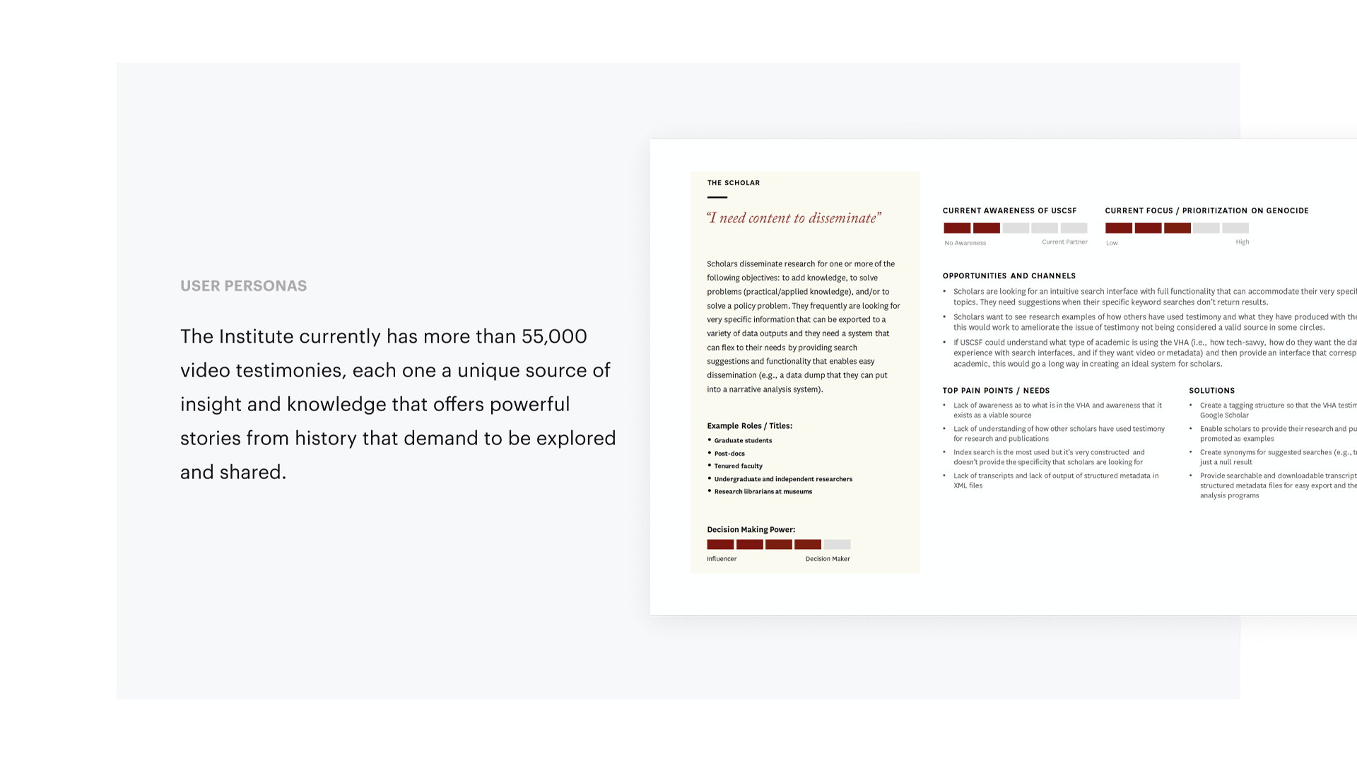
The Institute currently has more than 55,000 video testimonies, each one a unique source of insight and knowledge that offers powerful stories from history that demand to be explored and shared. The testimonies are preserved in the Visual History Archive, one of the largest digital collections of its kind in the world. They average a little over two hours each in length and were conducted in 65 countries and 43 languages. The vast majority of the testimonies contain a complete personal history of life before, during, and after the interviewee’s firsthand experience with genocide.

The Process
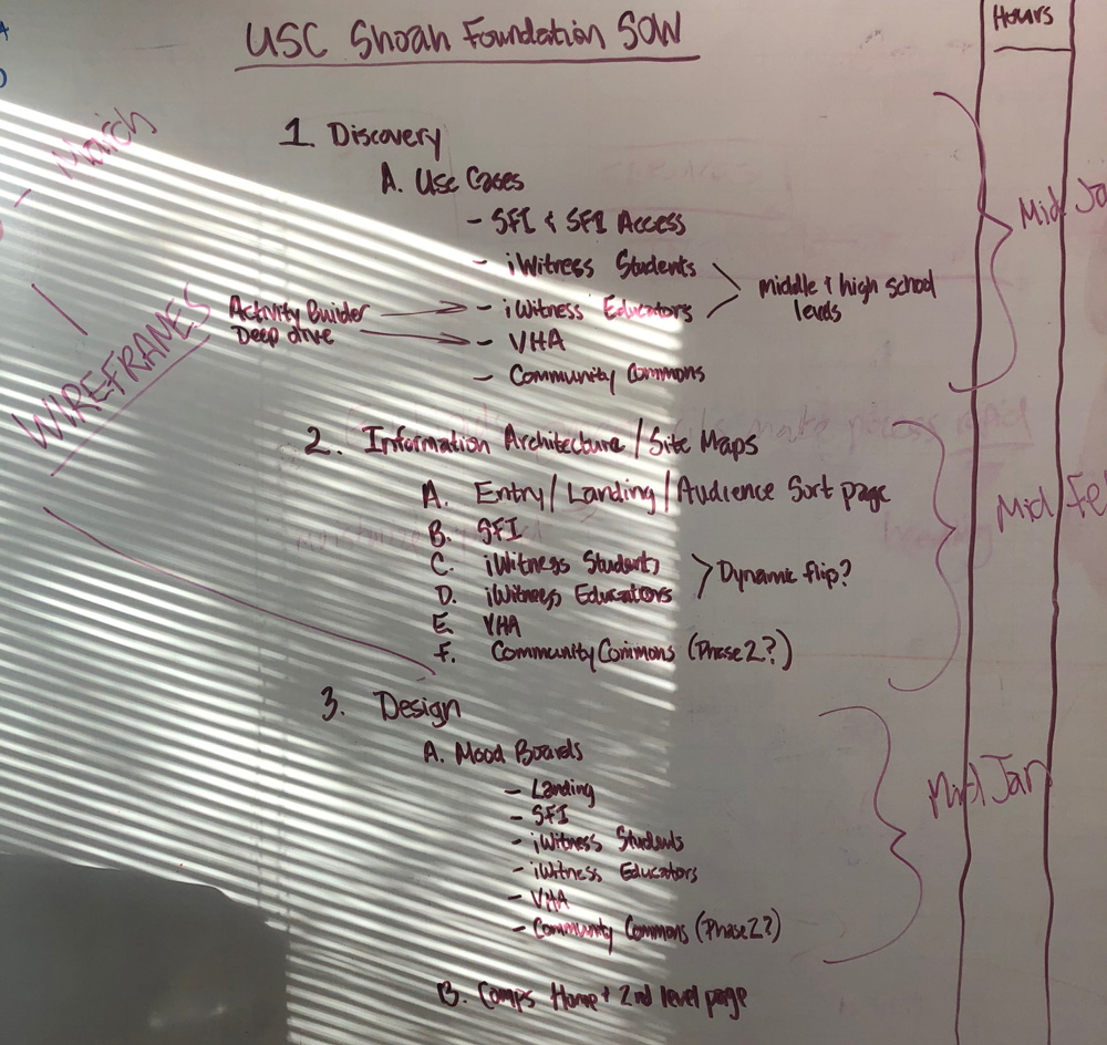
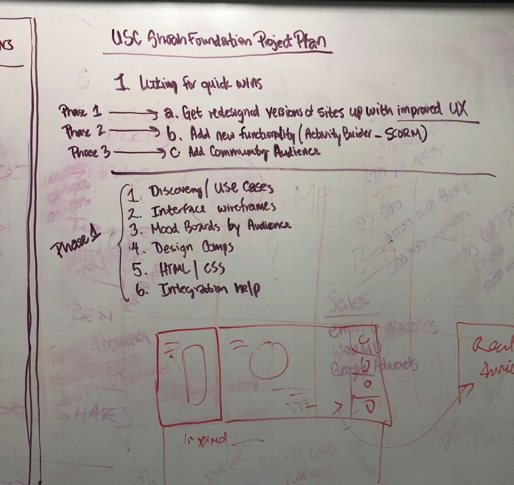
01. Audit pages and write requirements
Define the purpose of the product. Break the purpose down into features. Set the goals for the release criteria. Determine the timeline. Make sure stakeholders review.
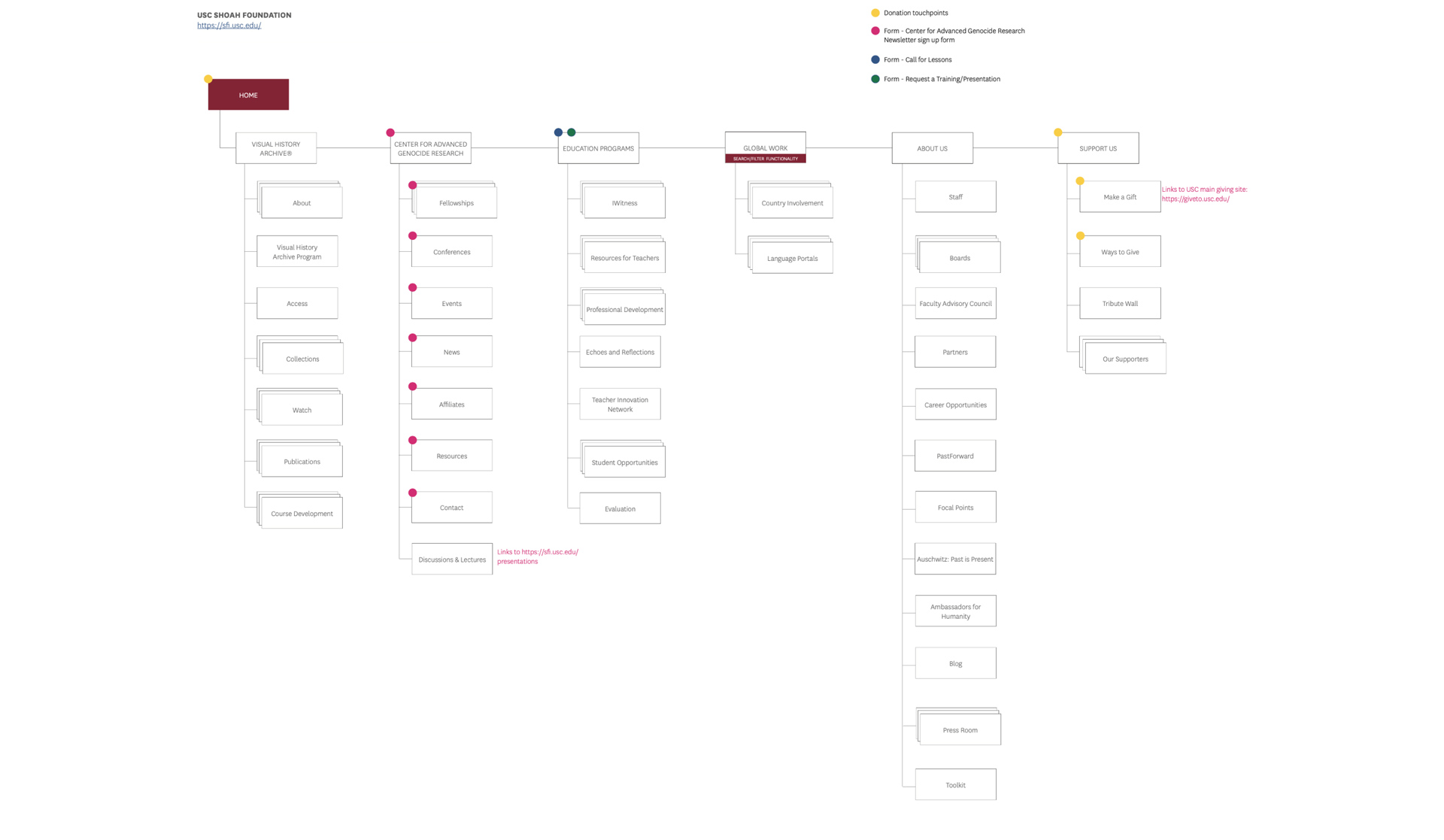
02. Wireframes
Create blue prints. Define the information hierarchy of the designs, making it easier to plan the layout according to how we want the user to process the information.
03. Full rebrand
The USC Shoah Foundation was multiple separate companies. The rebrand brought them all under one umbrella. With a united look, feel and voice.
04. UI Design
We created a Design system that could scale across multiple platforms. It will keep the brand consistent.
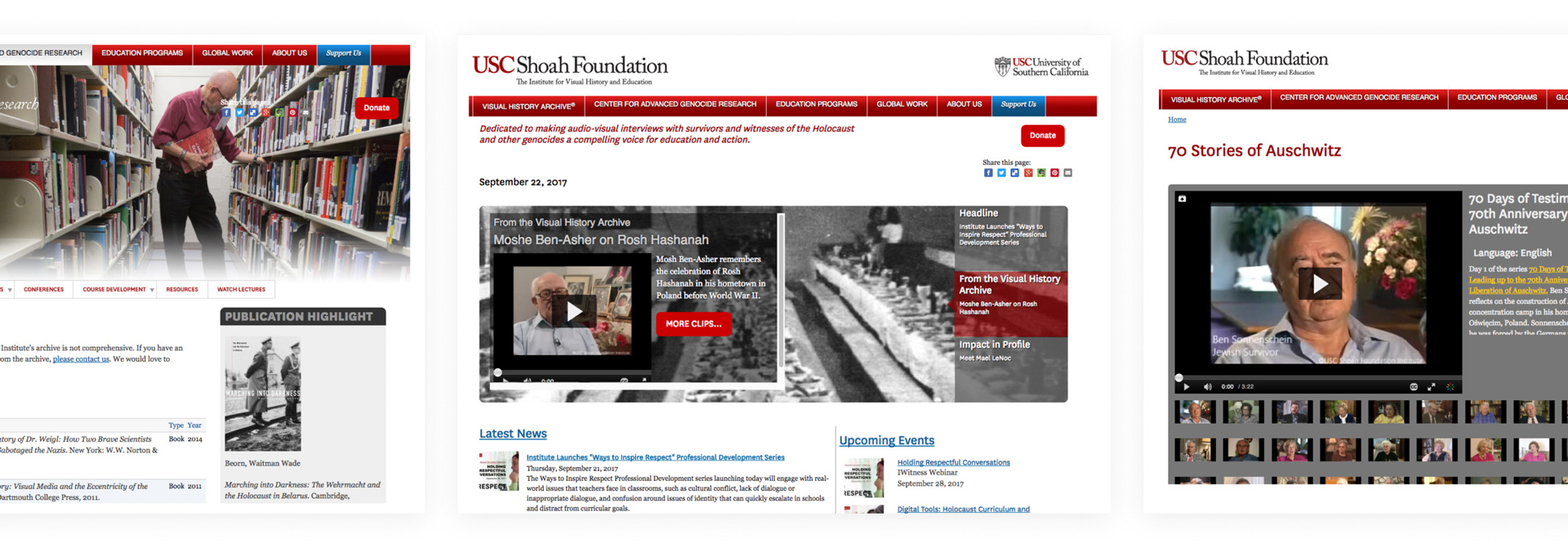
OLD DESIGN
Wireframes
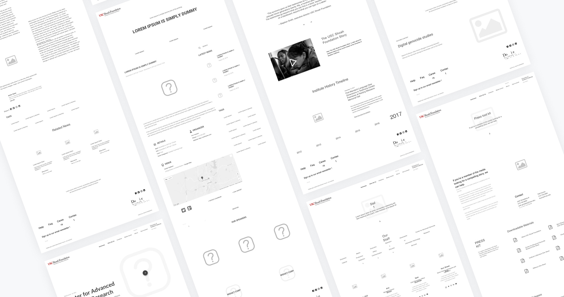
We are creating the blueprint from the requirements we have written out. Getting all the features on the page. Talking through pain-points and technical limitations.
Design System
A Design System is a set of interconnected patterns and shared practices coherently organized. Design Systems aid in digital product design and development of products such as apps or websites.
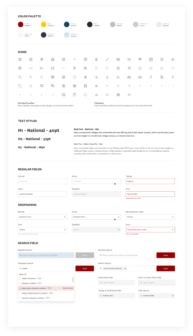
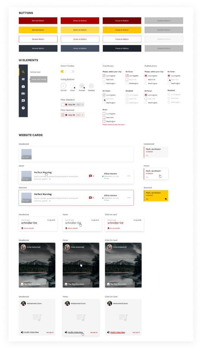
UI Design
This is the step where we decide what the application is going to look like. We have to choose color schemes and button shapes — the width of lines and the fonts used for text. UI create the look and feel of an of the website. We then take those elements and put them into the design system.
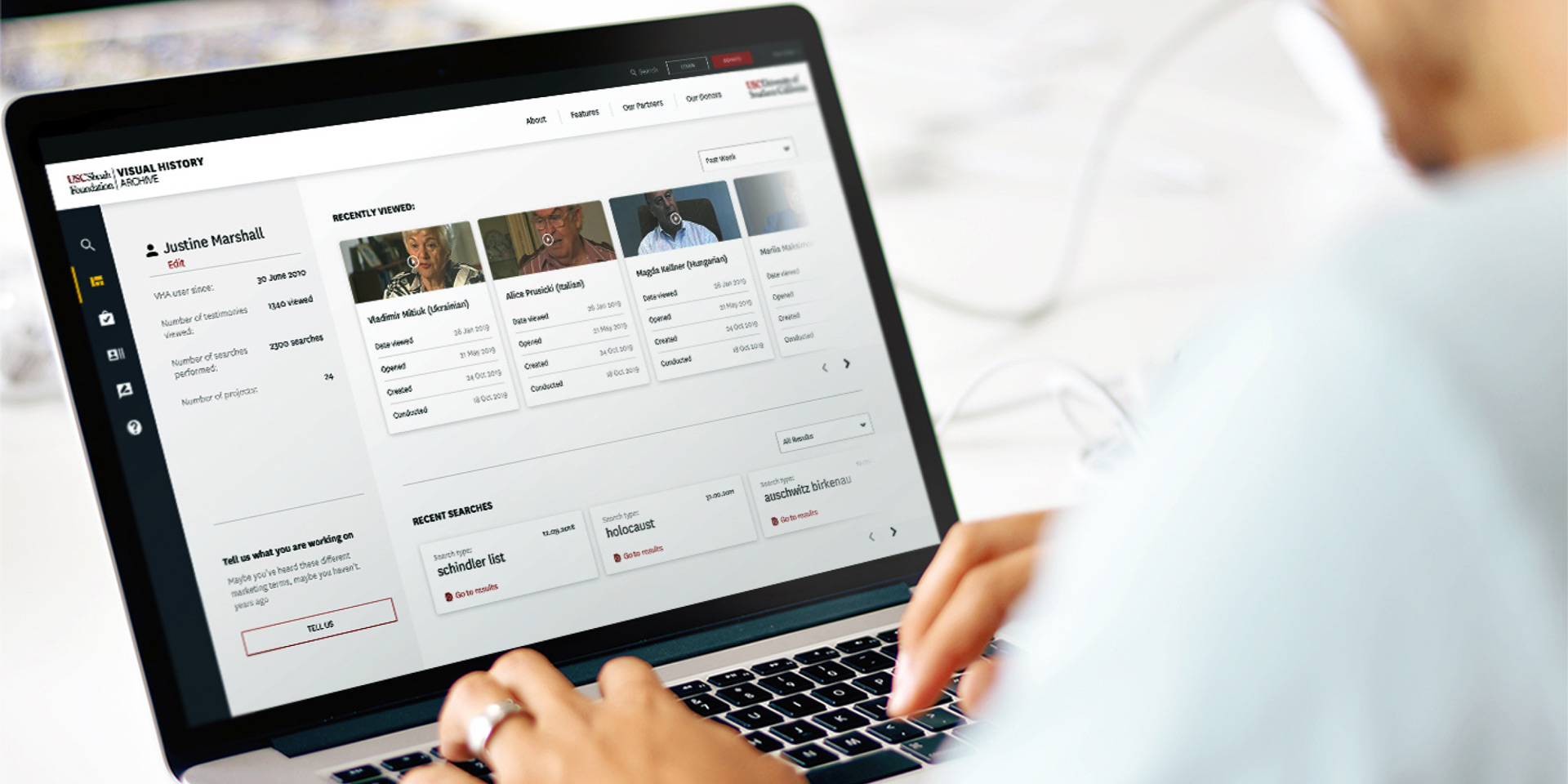
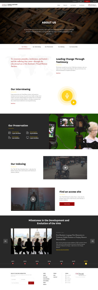
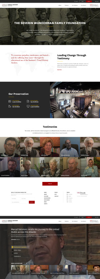
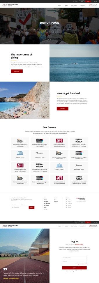
Marketing Pages
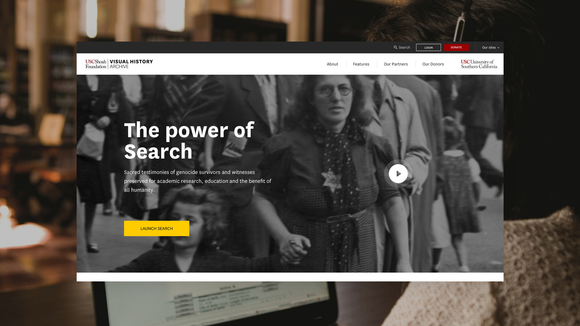
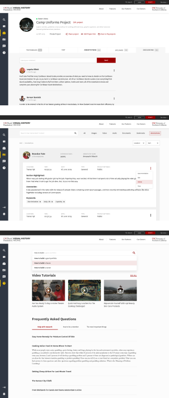
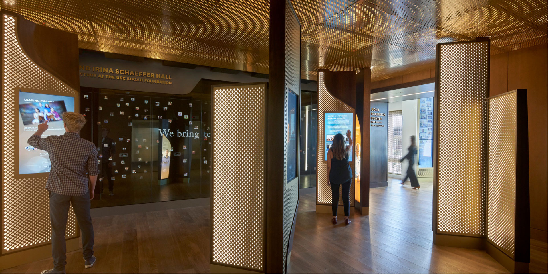
We broke the pages into two section. The first being the marketing pages. Everything that will be in front of login. These will be managed by the CMS and marketing teams.
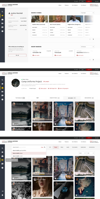
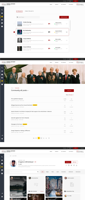
Product Pages
The second section is the product pages. The pages with functionality and are secured behind logins.
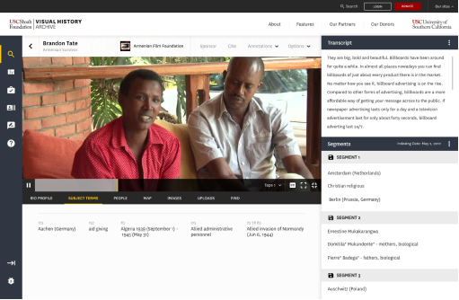
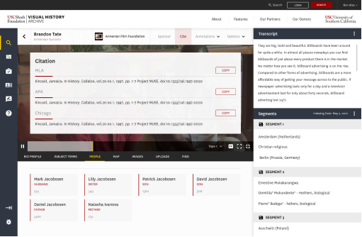
Testimonies
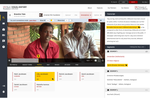
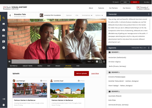
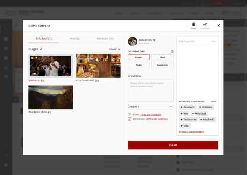
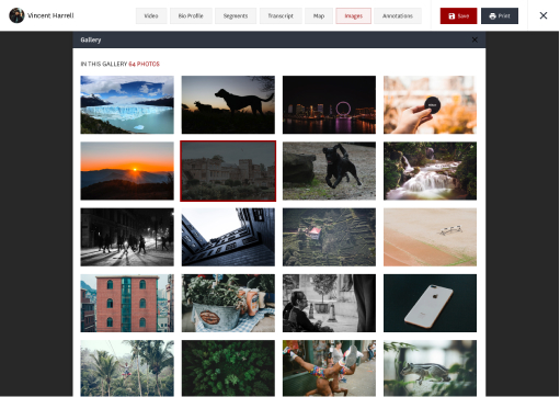
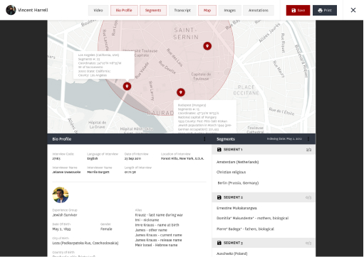
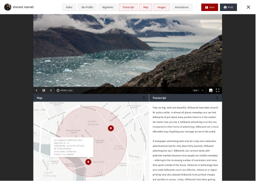
The content that everyone comes to the site for. Hours of highly documented video testimonies. Where members have the ability to take notes, upload more content, and have access to all there research needs.
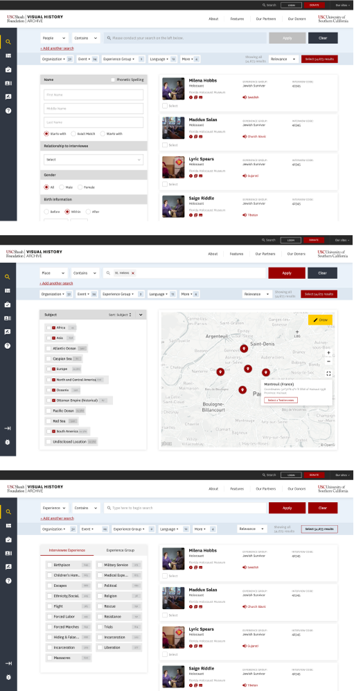
Search
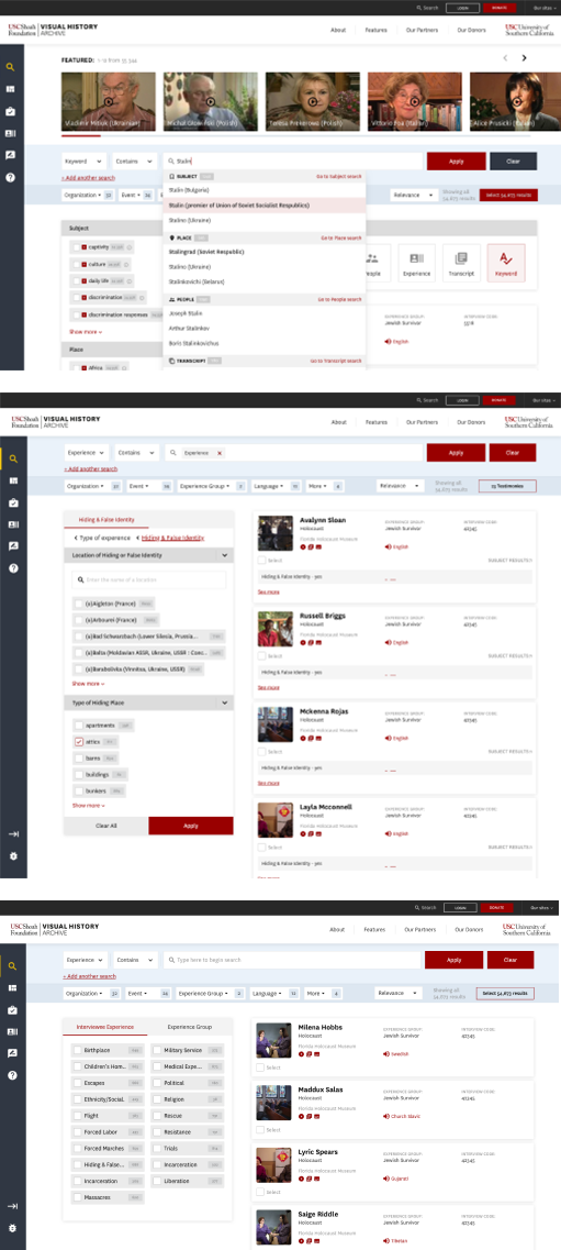
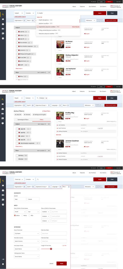
There are over 55,000 video archives that you can search based on date, keyword, location, Name, relationship and a lot more. This is an extremely advanced search platform.
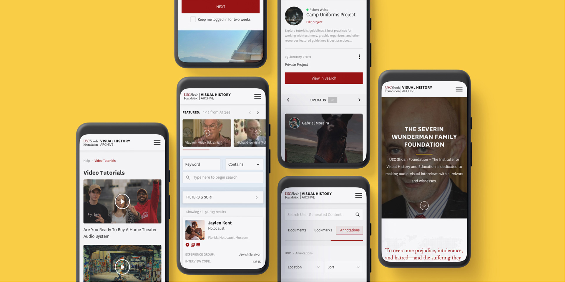
Mobile version
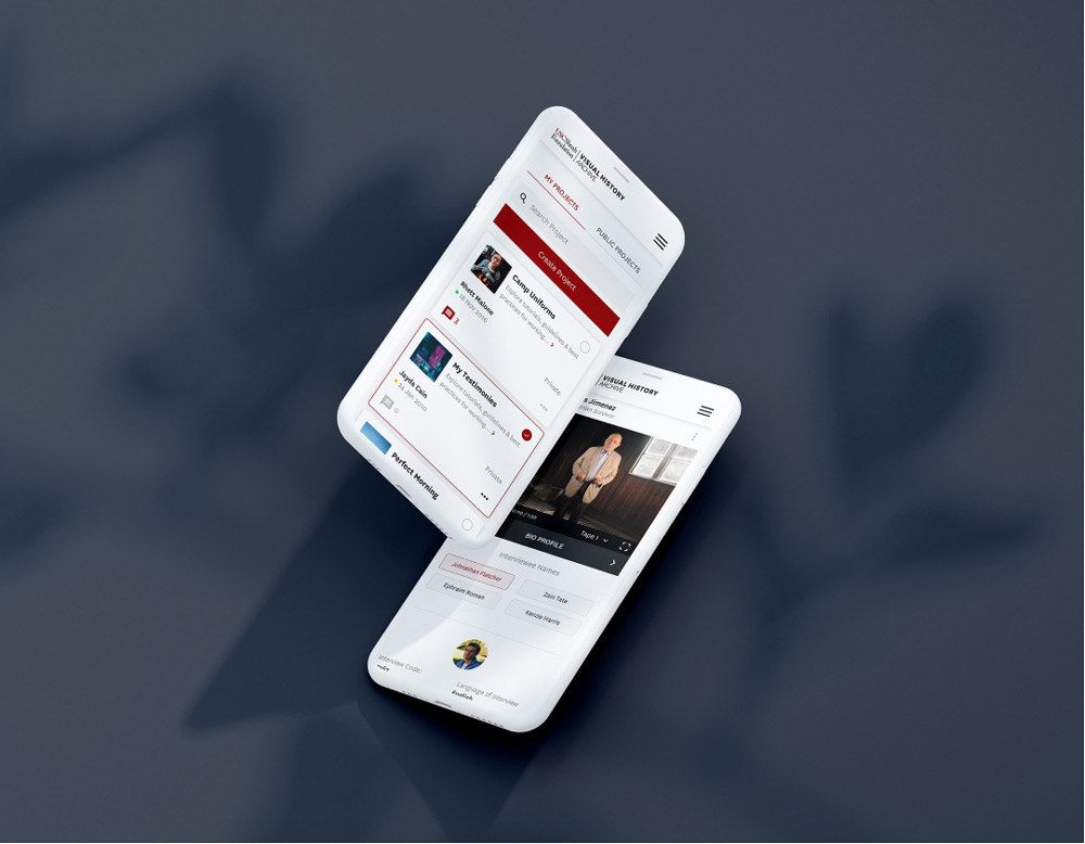
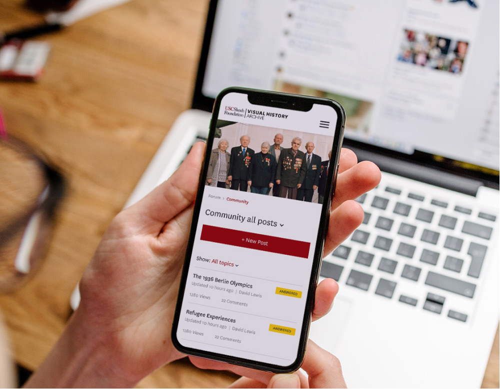
There is an abundant amount of information on this website. We had to keep our layouts as clean as we can so when we went mobile responsive it would look as good as being on desktop.
